AO1-Contextual Understanding
Idea sheets
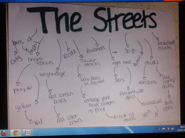
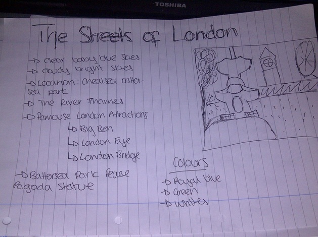
This was my first idea of The Streets of London. It's a breakdown of the idea sheet u see above, explaining what would be in the included in the shot.
|
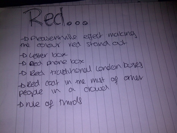
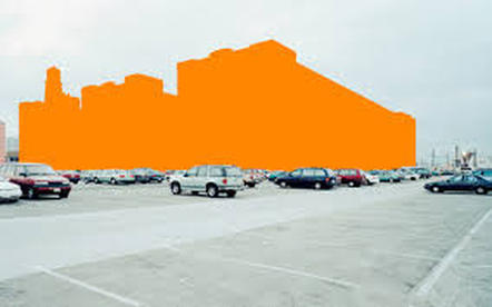
This was my second idea of Red. When researching about photography i came across the 'pleasentville effect' and was fascinated of the effect and wanted to maybe produce a series of images of different objects you see in London using the pleasentville effect.
|
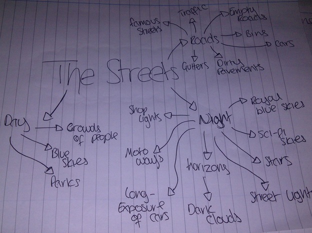
This was my third idea of the combination of The Streets of London and Red. Putting them together I wanted the final shots to not just have red objets, i wanted them to be more composed with more detail.
|
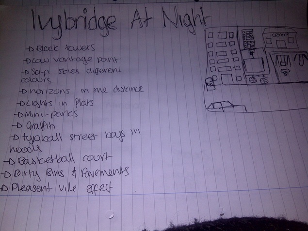
This was my last idea of Ivybridge At Night. This was what i finally decided to go with and carry out. The reason why i choose this plan because I was running out of time and was the simplest idea that i could then develop.
|
Mauren Brodbeck
Mauren Brodbeck was born in Geneva 1974, Mauren Brodbeck studied in the field of cinematography as a film director and a producer for short films. Mauren Bordbeck graduated in photography and design from the Art Centre College Design. She's currently a photographer who has many exhibitions.
|
|
|
|
|
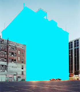
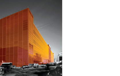
The image of office city like building but have been altered in the traditional Mauren Brodbeck way. For the reason why some of the buildings have been altered to be of a gold colour is because of their shape as they are unique and so Mauren Brodbeck wanted to exaggerate them shaped. The use of colour shows the importance in every picture that any artist edits or non edits and so as viewers our attention is automatically drawn to the gold building rather than the black and grey building in the background Depth of Field can be said to be used in the picture as its focused on the gold building rather than the black and grey. I personally like this picture, iv become a fan of Mauren Brodbeck work and out of all her work this is my favourite The reason for this would be because its has a modern look to it and it captures the shading of the building making it realistic but she hasn't stopped there, the roads looked polished as-well as the buildings behind.
|
|
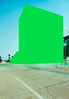
This is another picture of a city building that has been altered to be in a strong reflective modern and bold orange and then around it black and grey smaller buildings. We can see the reflection of other big building this suggests to me that these building are significant for example important offices of popular companies. One of the composition rules I see in the picture would be vantage point. The point is which the picture is at a slight slow angle, the effect of this has added to the significance off the building as-well as the colour. I personally like this picture as well as it a has a similar style of the picture before. I also think people would like this picture to of its modern concept, what also I like about the image is the shading of the orange building as well to make it realistic
|
|
|
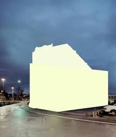
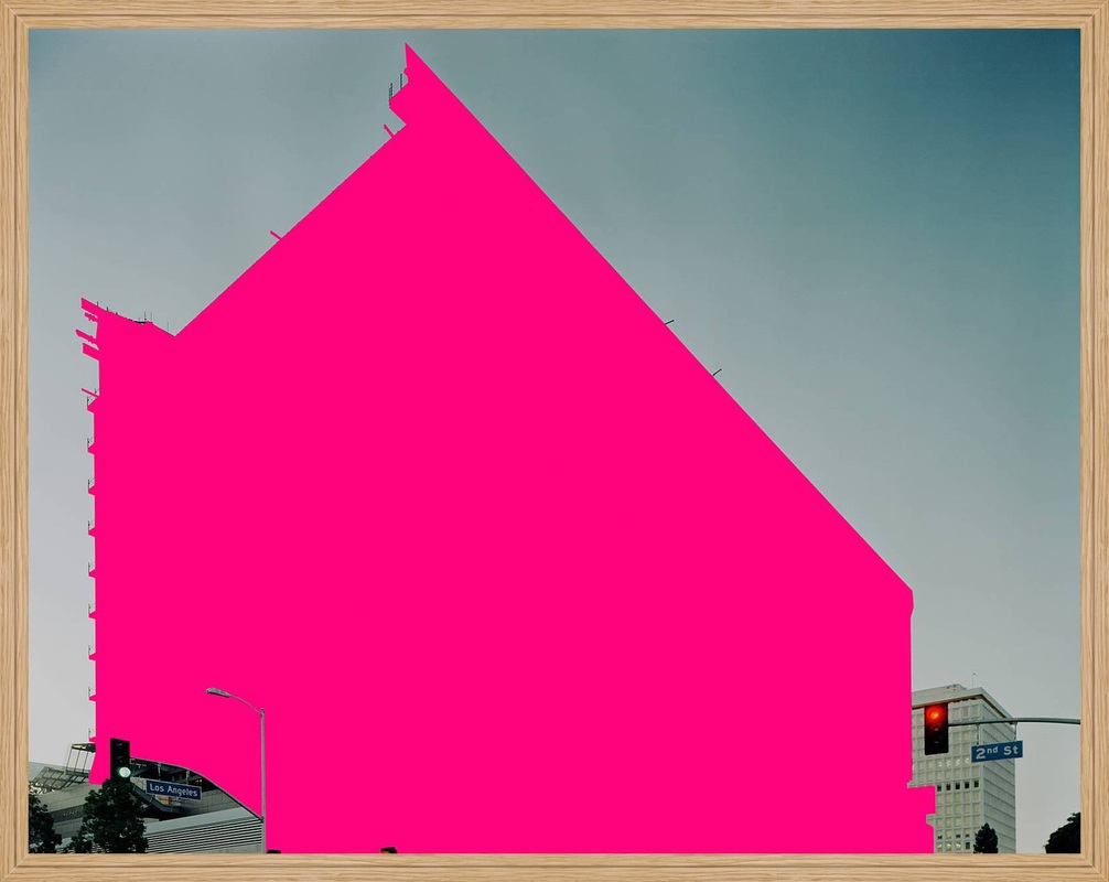
This photograph is of a big bold pink building with another building behind it with traffic lights. The biggest build has been altered to a very bold pink. Though out Mauren Brodbeck I have noticed that she always picks the biggest building to alter this may suggests she has an interest in big buildings. One of the composition rules I see in this photograph would be filling the frame, the building has taken most of the frame but you can still see the smaller buildings behind and the surrounding of the big building. This photograph is different to the others of the modern photographs and the only one that stood out to me of this style. |
My Interpretation of Mauren Brodbeck
Jakob Wagner Nightscape
|
Jakob Wagner was born 1985 in Herdecke, Germany. In summer 2008, he successfully completed his three-year apprenticeship as a photographer. He has since been living in Duesseldorf, where he has mainly been working as a freelance photographer, image editor and photo assistant. His work has taken him to many different countries around the world. When Jakob Wagner is not at work by assignment, he devotes much of his time and passion to his personal photography projects, which will culminate in future books and exhibitions
|
|
|
|
|
|
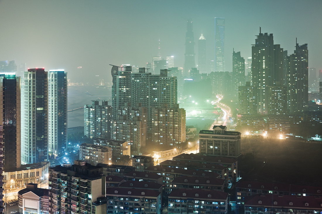
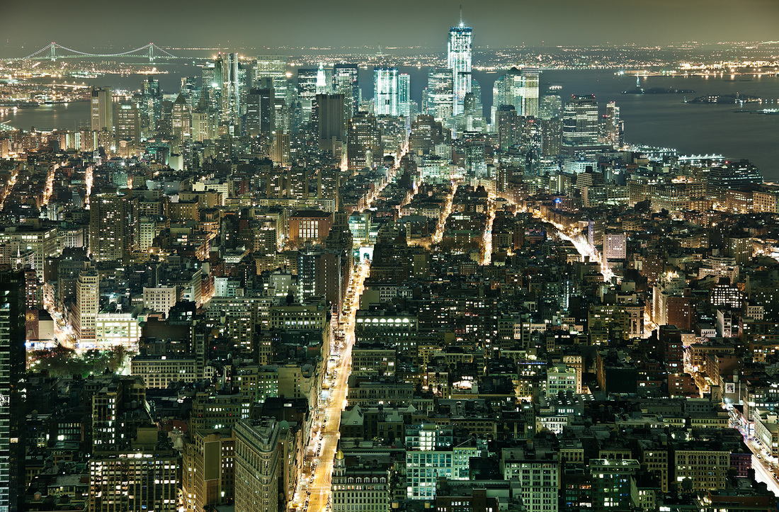
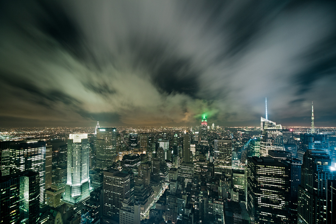
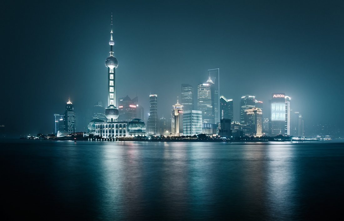
This is one of the first piece of work that I saw of Jakob Wagner that intrigued me. Its of city buildings at nights with lots of white and blue lights. The clouds in the sky where taken as you would take a picture using long exposure so make it different to just a picture of city buildings. The main colours in this photograph is blue and white lights, the use of these two colours make the photograph appear very bright and the effect of this is that you think you the camera and your there looking at the city, its more realistic. you also get shaded of green and orange which are not used much. The reason why it interested me was because of the impression it gave to me which was sci-fi, I can say that the clouds mostly give this impression and feeling. It has inspired me to create something similar as a possible final piece that is eye catching and make people look more than twice.
|
|
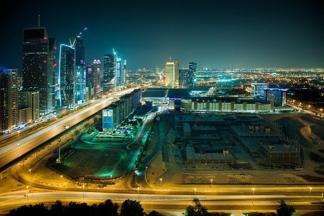
This is another photograph by Jakob Wagner that intrigued me. Its a photograph of a city somewhere in the middle east of different types of buildings giving different shapes in the shot across a sea. The main colours in this photograph is dark blues for the sky and then the the sea which is a darker blue and black on the edges, they is also some colour of white and grey which are the city light we see in the distance. The reason why this photograph interests me is because of the the reflection in the sea we see of the city. Jakob Wagner has taken this photograph and possible photo-shopped it so that as you more further away from the city it gets darker. I believe that Jakob Wagner did this to give a ghostly effect making the photograph more appealing to viewer.
|
|
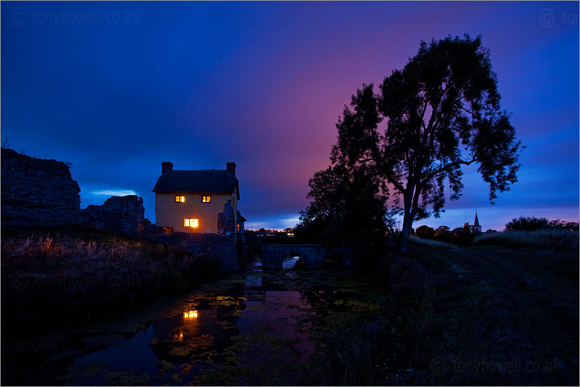
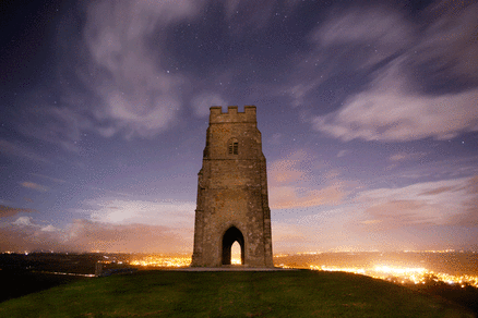
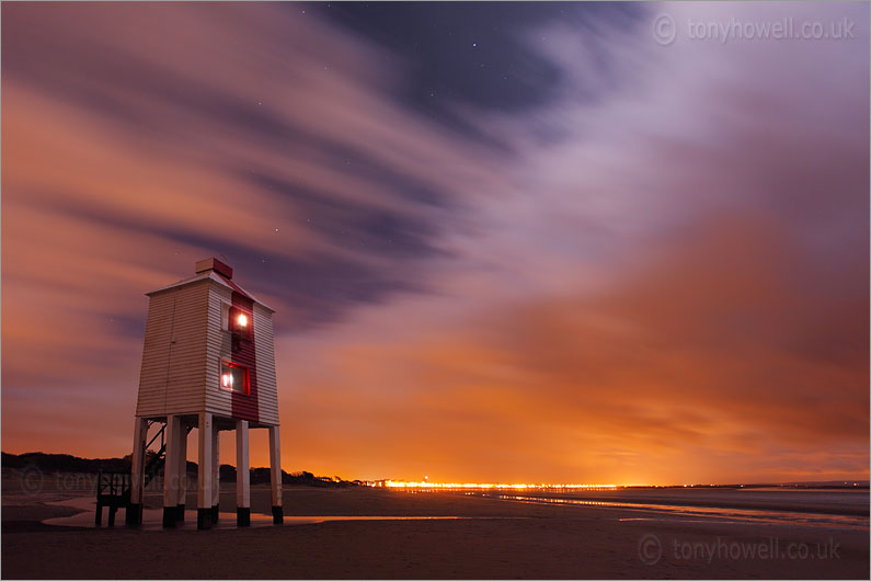
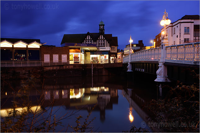
Tony Howell Nightscape
|
Tony Howell is a self taught photographer born in Plymouth, Devon, England in 1960 is one of England's finest landscape photographers. With over 35 years experience, he is based in Somerset, near Bristol. His style is instantly recognisable - simple, uncluttered compositions and an overall sense of peace and stillness borne out of his deep love of the natural world. Tony Howell hardly uses any filters in his photographs. He use a polarising filter to reduce reflections and glare; also to darken blue skies and increase saturation and also uses neutral density filters to reduce the shutter speed for moving water.
|
|
|
|
|
|
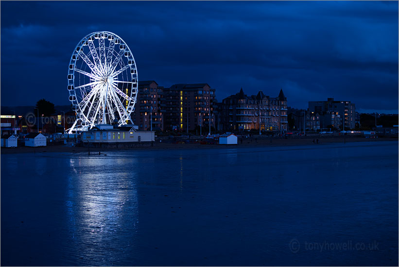
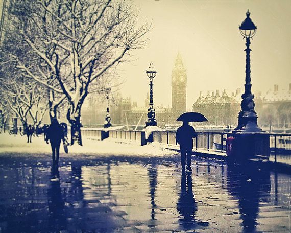
This is a photograph of Burnham Lighthouse. This is one of my favourite photographs taken by Tony Howell the reason being of how sci-fi it looks which links in with my idea of a final piece for this landscape unit. We can see a lighthouse and then in the distance lights of the city or town. What's most appealing of this photograph I believe would be the sky and the could's. One technique that is used by him to make the sky look different would be the long exposure, he let the clouds move creating a look as if the cloud's were being dragged and also gives of the cloud's being fluffy. The artist also uses the Rule of Thirds, the lighthouse is positioned to the bottom left corner and so this is the reason why its appealing to the viewers eye
|
|
This is a photograph is of the River Tone Bridge, Taunton Somerset England. In this image we see Tony Howell capture a blue sky with faded clouds, looking through his work I can spot his signature mark which is capturing unusual unique sky's. The use of reflection of the buildings and bridge in the water makes the photograph more appealing. What I believed that would make this photograph better would be maybe if he had Photoshop the sky so that the clouds are more visible. |
|
Ronya Galka Photography
Born and educated in Germany, Ronya moved to London in the early 1990s and it is there that she launched her photography career and developed her own style of urban and street photography, extracting the extraordinary from life around her.
|
|


My interpretation of Ronya Galka
|
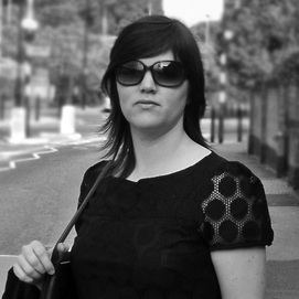
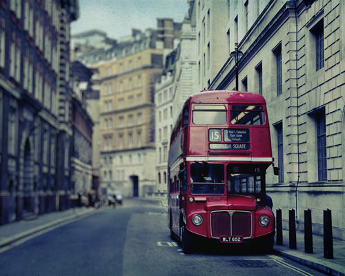
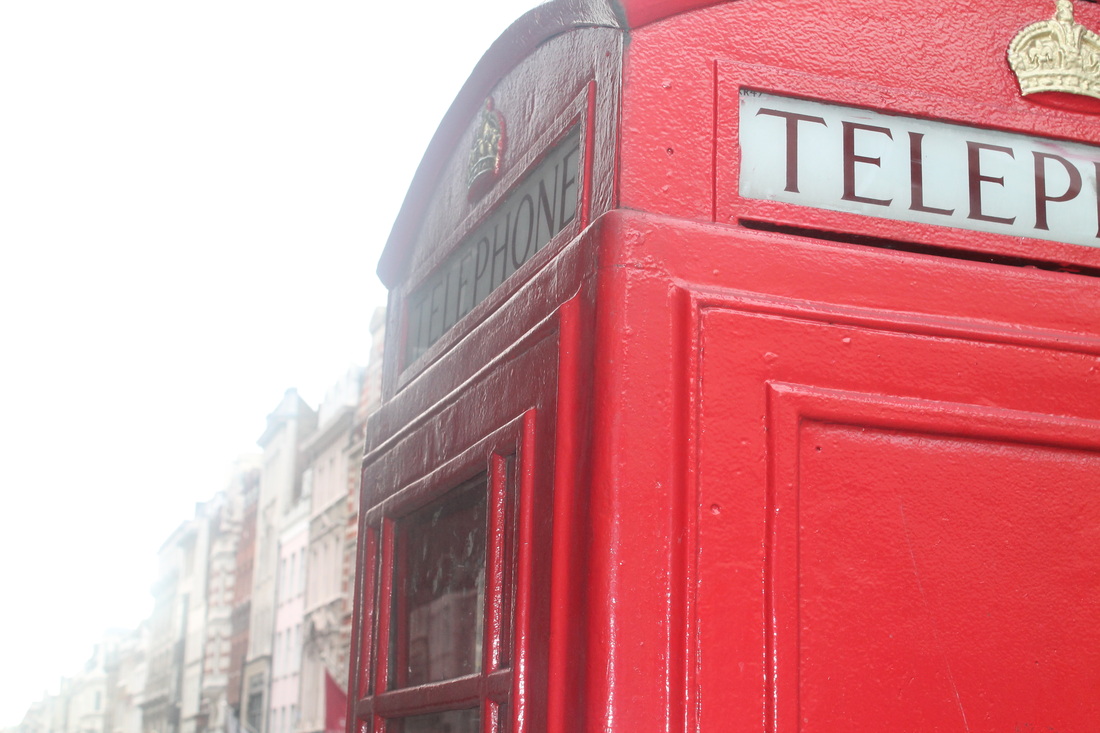
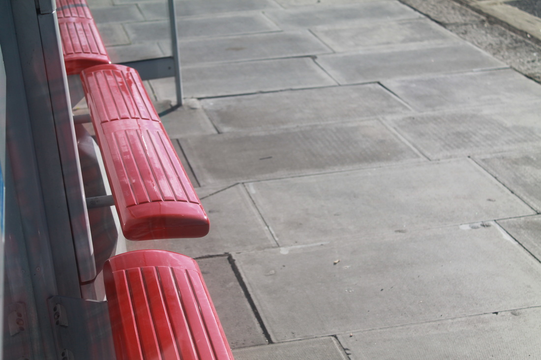
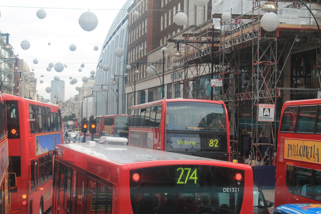
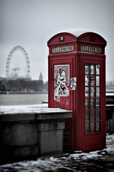
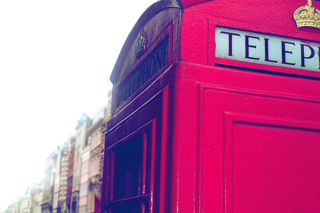
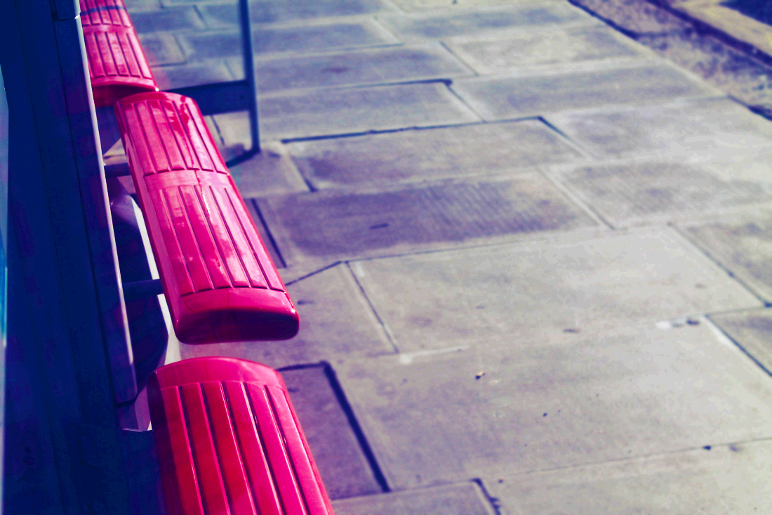
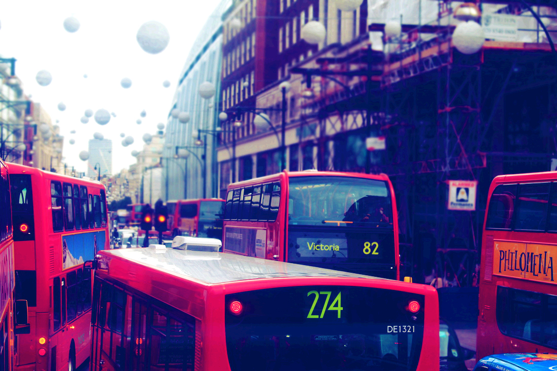
I went into London Oxford circus over the half term as I was inspired by the red bus and red phone by Ronya Galka as a possible final piece. This was my very my first photo-shoot I took so I could get a clear understanding whether my final piece would work. What I realized was that my us idea didn't work as they was too many buses making my images look messy as they where too many buses in my shots. For my letterbox idea I found it was possible to do as in my frame it is the only object that are red and same thing applies to the red bus seats. |
|
Top 6
|
These were my top 6 of my interpretation of Rony Galka that I thought were more appealing to the eye. The reason why they belong in the top 6 is because the fulfilled the objective which is to fill the frame with the colour red. To make them more in the style of Rony Galka id need to photo shop. On the left we can see that she blurred the back ground creating depth of field. Another technique she uses is the pleasent-ville effect so that the colour red stands out. They is also the colours blue and grey , so when trying to photo shop my photographs into hers I will have to apply one of colours. |

|
|
|
|
AO2- Creative Making
The 5 Rules of Composition
"the placement of visual elements or objects with a frame or a shot in order to achieve harmony or balance and make the piece more visually appealing"
1.Filling The Frame
|
|
My understanding of filling the frame is what it says it it. you have to fill one shot or frame with one object focusing on nothing else but that object. Sometimes you may find with some objects where you can see the backgrounds for example if the object is a flower you may see leafs of grass in the background but as long as the focus is the flower that is filling in the frame, as long as the audience first notice the flower that is filling in the frame. |
2.Framing The Subject
|
My understanding of framing the subject is that its a technique used to draw attention to a subject by using another object for example this also involves the detail of the frame used to be lost making it darker so that the subject it what is notices and not the frame it self |
|
3.Vantage Point
|
|
My understanding of vantage point is that its any angle of view a photograph is taken. Most pictures are taken from the same vantage point which is at eye level however any photograph taken from a different point of view is naturally more appealing to the human eye, different vantage points can the manipulate the size or scale of the subject for example a low angled shot of a building can add emphasis onto the subject making it look superior and high angled shot of a person can add emphasis that the person is inferior. This is shown below using the example of a basketball hoop and a person. |
4.Depth of Field
|
Depth of Field is when a photograph is taken from near to far that appears to be in focus. They are two types of depth of field Shallow this involved the camera setting being at F-Stop 3.5 and in the setting of either sports or portrait mode. What this will do that its will focus on the subject you want to be focused on and make its surrounding blurred so that the human eye focuses on only that. The focus point dose not always have to be in the foreground it can also be in the background so that the foreground is blurred. The second type of depth of field is Large this involves the camera setting being at F-Stop 32 and in the setting of either landscape or mountains mode. What this will then do is that it will focus of every object in the shot nothing will be blurred. |
|
SHADOWING Depth of field
Before&After
|

|

|
|
This part of the compositional rule we took ages that we were going to photoshop to show shadowing depth of field. Our teacher first showed is and we were expected to then go and photoshop the images that we had taken before hand to illustrate shadowing depth of field. As i had not use photoshop before this would be my first time so i had to get some people to remember the steps we had been shown.
5.Rule if Thirds
|
|
Rule of thirds is a guideline you can use when composing a photo. The photo divides into thirds horizontally and vertically, and you try to align parts of the photo within the thirds. Using rule of thirds, it adds a lot more interest to the photo, and can make it much more visually appealing to an audience. 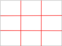
|
AO3-Reflective Recording
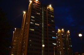
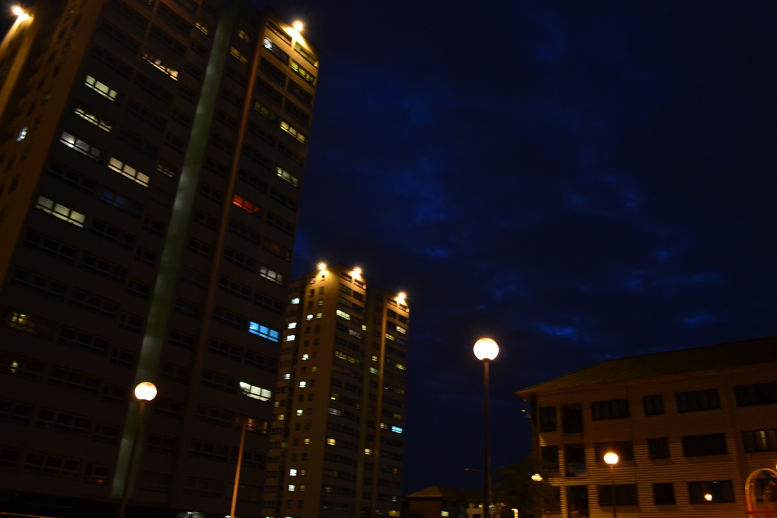
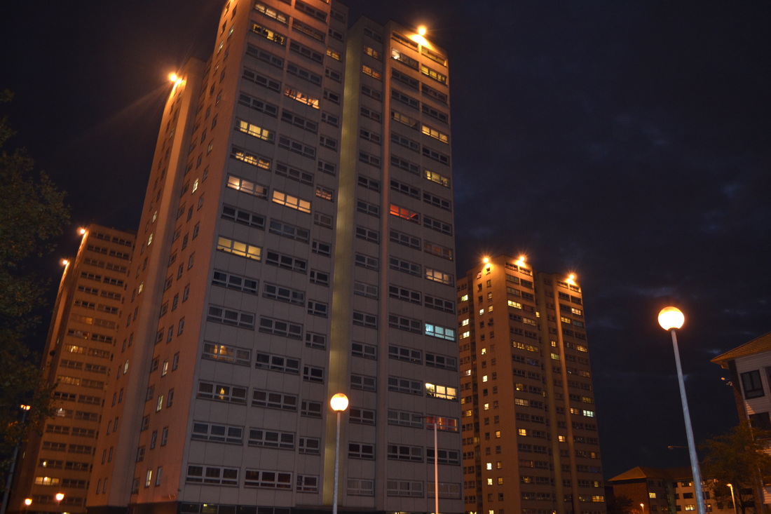
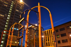
Photo shoot 1- Ivybridge at night
|
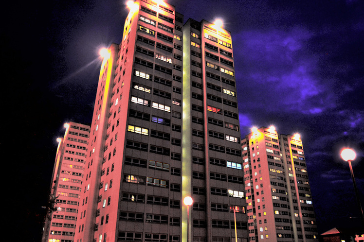
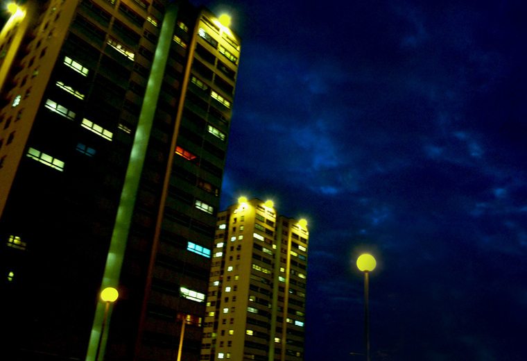
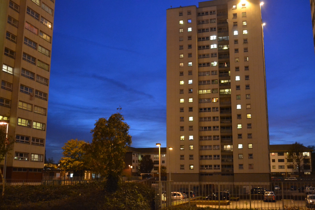
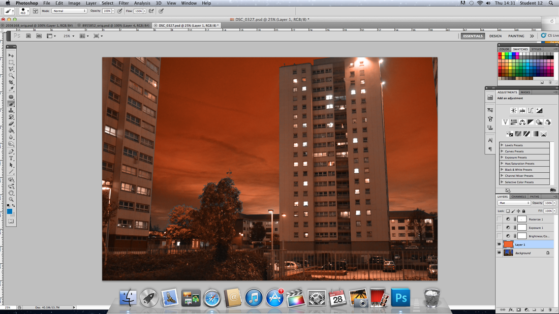
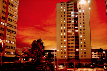
This was my first photo that took place in Ivybridge estate. I live on the estate and so at night when walking home I start to see the the vantage point composition and it intrigued me. I choose to start my shoot when the sun had set but it was too dark so that I could get colour from the sky, as I took the shots I started to see that I was getting a faint dark blue clouds. To enhance the sky I started to play around with the setting of my camera until I could get a clear shot where the blue sky had more colour in it. Out of all the pictures I took for this photo shoot the first two from the left at the bottom I would have to say are my favourite. The reason why they are my favourite is because of the different lights that are coming out of the tower blocks, it wouldn't be as interesting if they wasn't any lights or if the lights were all the same. I see come similarities to Jakob Wagner's style of different lights coming out of the city buildings as I mentioned before the the tower city buildings and unique Sci-fi skies. Another reason why they are my favourite is because of the dark blue clouds that as a Sci-fi effect to the photograph and so for that reason I would possibly use this image for a final piece. |
To achieve these photographs I had to play around with the setting of my camera. First I changed my camera setting to portrait and I saw that the I was taking good photographs by they wasn't similar to Jakob Wagner and Tony Howell's style, they came out plain and all the lights looked similar as you can see in the bottom two photographs on the left and so then I started to play around with the shutter and letting an amount of light into the camera and that's where I started to get different colours of light and the clouds became more defined with the two different shades of blue.
Even thought the top two images on the left are my favourite, I don't think they are final piece quality the reason being is because they are too dark compared to Jakob Wanger and Tony Howell's pieces as we can see above their work still give that Sci-fi feeling and look but they are not dark, they have the element of light within their work but with the right amount of darkness so they are Sci-fi. |
|
|
|
|

|

|
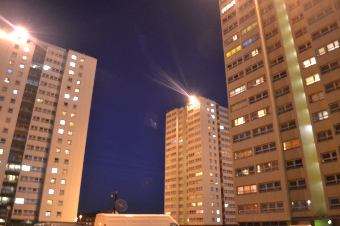
Photo shoot 2- Ivybridge at night
|
Again with the bottom three pictures I found that they fit with my concept and were similar to my last photographs that I choose for possible last pieces but they would also need to be photo shop'd the same way I did with the first ones so that they have the same theme going on.
|
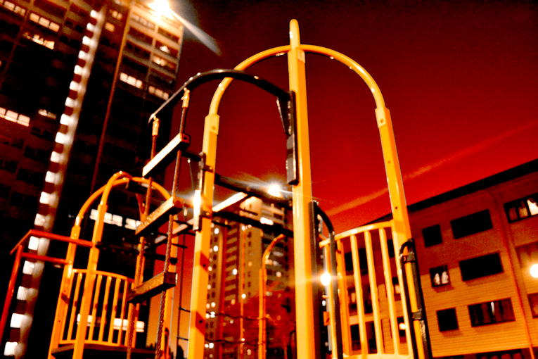
This was my second photo shoot in Ivybridge where I tried to focus less on the big tower blocks and more on their surrounding to see what else I could capture. With this photo shoot I went out at 2 different points of the evening, first point was when the sun was going down and the sky on the bottom was a light blue and the top half a darker blue.
I began to look at aspect of Ivybridge that are popular one being the baby parks located around the estate. Something else I tried was long exposure with the the traditional H20 bus of Ivybridge. Some of the compositions I used in this photo shoot was similar to the last which was vantage point from a low angle but also I tried vantage point from a straight view. |
|
|
|
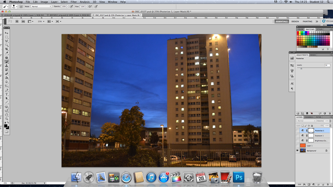
Process of final pieces
|
|
|
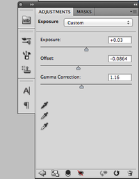
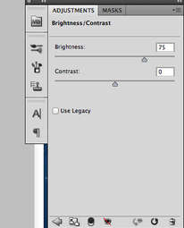
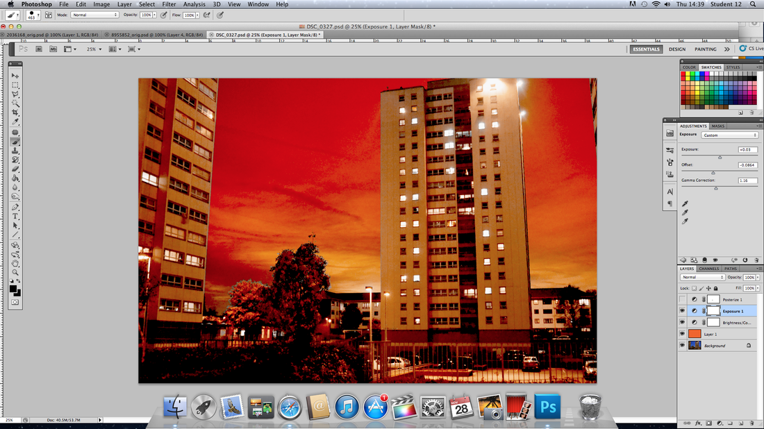
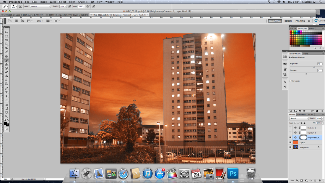
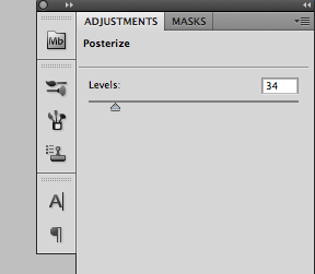
For each of the final pieces photographs I used different methods to reach the final similar result. Before photograph I had never used photoshop and so I had to experiment at first to see the different end result i wanted. With the help of my teacher and students who were familiar with photoshop I then learned the different things I could do with my images I had taken. In the style of the photographers i was looking at my initial objective was to make my final pieces look sci-fi to so this i started to play around with colours. In Tony Howell photographs he emphasised the sky and this is something that I did in my final pieces, the clouds in the sky helped to do this.
AO4- Personal Presentation
Ivybridge At Night